Chapter 9
Chapter 9 Slides(pptx)
Errata
Last updated 2019-11-01
- p. 149 Fig. 9.3 caption corrected to: Effect of the instrument point-spread function on an image of a double slit. The ‘perfect’ image, proportional to FT[f_i(x’,y’)] in eqn (9.2), is shown dashed. The ‘actual’ image function in the focal plane, f(x) where E^(f)=E_0f(x), is shown in black. The (normalised) point spread function is shown in light grey.
Extras
Diffraction-limited imaging: the resolution limit in photography
Topics: Airy pattern, f-number, pixel size, Bayer filter
A key question for many photographers (and microscopists) is, what is the smallest detail I can see? This was the question that Carl Zeiss asked of local physics professor, Ernst Abbe, in 1868. The answer surprised them both (see p. 147 in Optics f2f). Abbe initially thought that the answer was to reduce the lens diameter in order to reduce abberations, but when Zeiss found that this made things worse, Abbe realised it was diffraction, not aberration, that limits the resolution of an image. The larger the effective diameter of the lens, i.e. the larger numerial aperture, the finer the detail we can see. Next time, you think about investing in a camera with more pixels, spend some time thinking about diffraction, and whether those extra pixels are going to help, because the fundamental limit to the quality of any image is usually diffraction [1]. In this post, we consider the question of pixel size and diffraction in the formation of a colour image. As a gentle introduction, let’s look at an typical image taken with a digital camera, Figure 1. As you zoom in on a part of the image you can start to see the individual pixels. The questions you might ask are, if I had a better camera would like see more detail, e.g. could I resolve the hairs on the bees leg, and what does ‘better’ mean, more pixels, smaller pixels, or a more expensive lens? You might also wonder where the strange colours (the yellows and purples in the zoomed image) come from. We will also discuss this.
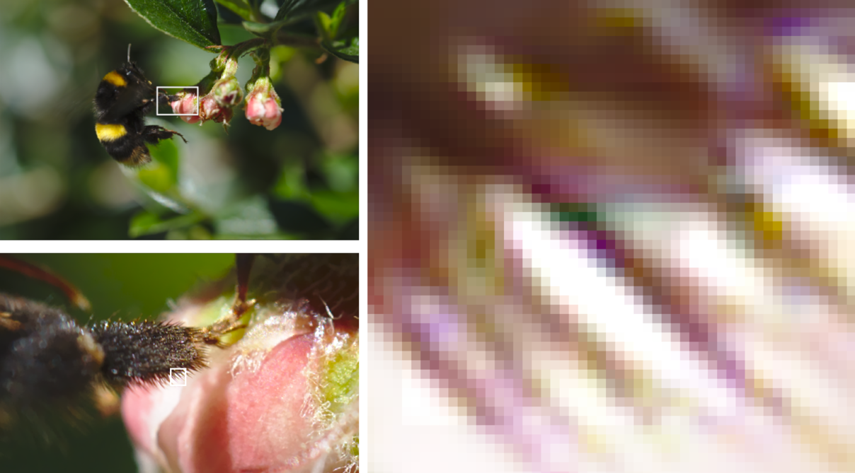
Figure 1: Image of a bee (top left). If we zoom in (bottom left) we can see how well we resolve the detail. If we zoom in more (right) eventually we see the individual pixels, in this case they are 4 microns across.
To start to answer these questions we need a bit of theory. The diffraction limit of a lens (which is set by the point spread function, i.e. the spatial extent of the Airy pattern), by which we mean the smallest spot we can see on the sensor, ∆x, is roughly two times the f-number times the wavelength,
∆x ≈ 2 f# λ,
where the f-number is simply the ratio of the lens focal lens to the lens diameter (f# = f/D). This is a rough estimate as a diffraction limited spot does not have a hard edge, but it is a good rule of thumb [2]. Using our rough rule of thumb we can estimate that using an f-2 lens, the minimum feature size I can expect to resolve using red or blue light (with a wavelengths of 0.65 and 0.45 microns respectively) is approximately 3 and 2 microns, respectively. If we aperture the lens down to f-22, then the minimum feature size using red or blue light (with a wavelengths of 0.65 and 0.45 microns, respectively) is 28 and 20 microns, respectively. These latter values are much larger than that the typical pixel size of most cameras (often 4–6 microns on camera sensors, although smartphones often have pixels as small as 1 micron), so it is important to remember that when using a small or medium aperture (high or mid-range f-number) the quality of an image is limited by diffraction, not pixel size. For colour images, the fact that diffraction is wavelength dependent becomes important. The equation above tells us that the focal spot size is dependent on the wavelength, i.e. it is harder to focus red light than blue, so even if we have a perfect lens with no chromatic abberation we could still find that a focused white spot (such as the image of a star) has a reddish tinge at the edge (we will see this in some simulated images later). We could correct for diffraction effects in post-processing but we have to make some assumptions that may compromise the image in other ways and often in practice other abberations or motional blurr are also as important. Another complication is that the sensors used for imaging are not sensitive to colour, so to construct a colour image they are coated by a mosiac of colour filters such that only particular pixels only sensitive to particular colours. The most common type of filter is known as the Bayer filter, where in each 2×2 array of 4 pixels there are two green, one red and one blue. We can see how the Bayer array works in the image below which shows how the image of a white ‘point-like’ object such as a distance star is recorded by the red (R), green (G) and blue (B) pixels (three images in the top row), and then below how the image is reconsructed from the individual pixel data. The middle image in the bottom row shows how the white spot is reconstructed from the RGB pixel data by interpolating between pixels. The image on the right shows what we would get with a monochrome sensor. The size of the image is diffraction limited. The example shown is for say 1 micron pixels with an f-22 lens (we will look at lower f-numbers laters). The key point of this image is to show how the red image is larger which leads to the reddish tinge around the image.
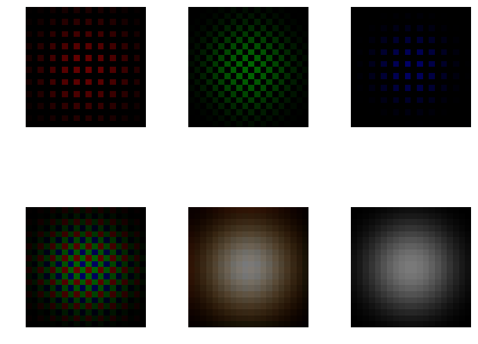
Figure 2: Top row: From left to right. The R, G, and B response of a colour sensor to a focused white-light ‘spot’. Bottom row: From left to right. The combined RGB response. The combined RGB response with spatial averaging. The ideal white-light image.
The python code to make this image is available here. The Airy patterns (see Optics f2f p. 78) for each colour (wavelength) are calculated on lines 16-21. The Bayer tile is defined on lines 23-25. The detector is tiled with Bayer superpixels in lines 27-29. The rest of the code makes the plots. The only other subtlety is the gaussian filter on lines 69-71 which performs a spatial average over neighboring pixels for each colour channel. Now that we have a model of a colour sensor, it is interesting to look at more interesting images. The simplest question is can we resolve two bright spots such as two nearby stars (or two nearby hairs on a leg of a bumble bee as in Figure 1). The image below shows the case of two white spots. By clicking on the image you can access an interactive plot which allows you to vary the spacing between the spot and the f-number of the lens.
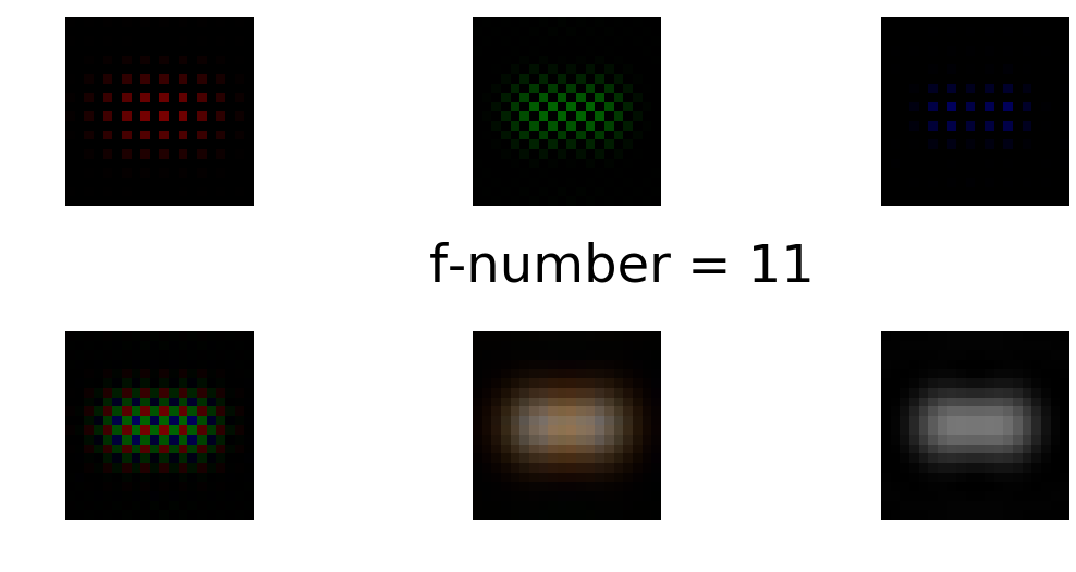
Figure 3: Similar to Figure 2 except now we are trying to image to white spots. If you click on the figure you get an interactive version. Avoid IE!
Try setting the f-number to f-11 and varying the separation. Again we can see the effects of diffraction as in the reconstructed image (in the middle of the bottom row) we see the less well focused red filling the space between the two spots. In these examples we are diffraction limited and the finite pixel size is not playing a role. If we did have a very small f-number and relatively large pixels we might start to the see that effects of pixelation. The first clue the we are pixel limited if the false colour effects of the Bayer filter. If our feature width is less that the separation of either RG or B pixels as in Figures 4 and 5, then the Bayer filter produces false color as illustrated in the image of three white squares below. The bottom left image is what the sensor measure, the bottom middle is the output after averaging.
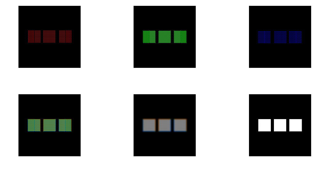
Figure 4: Image of three white squares where the diffraction limit is smaller than the pixel size.
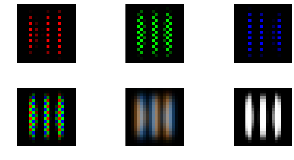
Figure 5: Similar to Figure 4 but now showing three white line and zooming in to only 20×20 pixels. The Bayer discoloration (bottom middle) is particular pronouced in this case.
We saw these colour artifacts in the bee photo shown in Figure 1. The averaging algorithm constructs inappropriate RGB values on particular pixels. Basically the algorithm has to make up the colour based on values on nearby pixels and if the colours are changing rapidly then it gets this wrong. To summarise, almost certainly your camera images are diffraction limited rather than pixel limited so buying a camera with more pixels is not going to help. Better to invest in a better lens with a lower f-number than a sensor with more pixels. If you have a good lens then the first clue that you might be reaching the pixel limit is colour articfacts due to the Bayer filter. [1] In comtemporary microscopy there are some way to beat the diffraction limit, such as STED, the topic of the 2014 Nobel Prize in Chemistry. [2] The exact formulas are given in Chapter 9 of in Optics f2f, where we also learn that resolution limit is also a question of signal-to-noise, see e.g. Fig. 9.6 reproduced below using this code. At best we should think of concepts such as the Rayleigh criterion as a very rough rule of thumb.
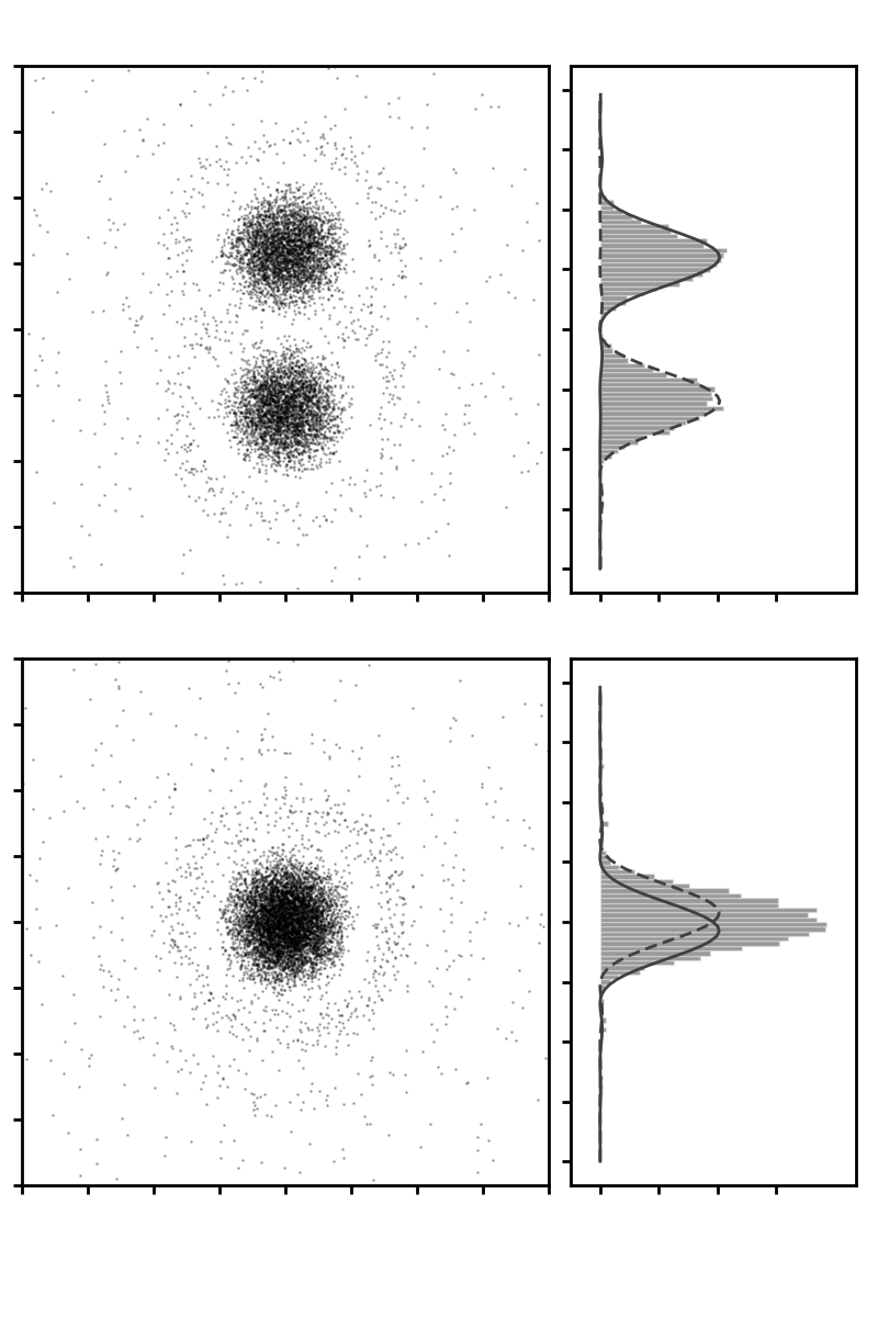
Figure 6: Photon counts on a screen of two ‘point’ sources. By fitting an Airy pattern we can measure their separation. If the signal-to-noise is sufficient we can easily resolve separations as small or smaller than suggested by the Rayleigh criterion, as illustrated in the lower plot where the separation is one half of the Rayleigh criterion. In the code, try reducing the separation between the sources (2*y0) and try varying the signal-to-noise by changing the number of photons (num).
White-light imaging
Topics: point-spread function, coherent and incoherent imaging, optical transfer function
There are significant differences between what are ‘loosely’ called ‘coherent and incoherent imaging’. Coherent imaging typically refers to a monochromatic source like a laser whereas incoherent imaging refers to a broadband source like a lamp or sunlight. We say ‘loosely’ because as Chapter 8 in Optics f2f emphasizes, coherence is not an either, or, and light can become more coherent as it propagates through a instrument. A more precise definition would be to say that coherent and incoherent imaging correspond to situations where the transverse coherence length of the light is larger or smaller than minimum feature size in the image. In the former case we can expect to see intensty fringes in the image, whereas in the latter case these fringes are smeared out by the time and spatial averaging. This is illustrated in Figures 1 and 2 which show the case of coherent and incoherent imaging of a slit (represented by a rect function). For coherent imaging the observed intensity is given by the modulus squared of prefect image field convoluted with amplitude point spread function of the instrument (usually a jinc function, see p. 148 in Optics f2f). Whereas for incoherent imaging the observed intensity is given by a convolution of the intensity of the perfect image with the intensity point spread function (usually an Airy pattern). The python code to produce these plots is available here. The code assumes that the field is uniform in the y direction and uses sinc rather than jinc.
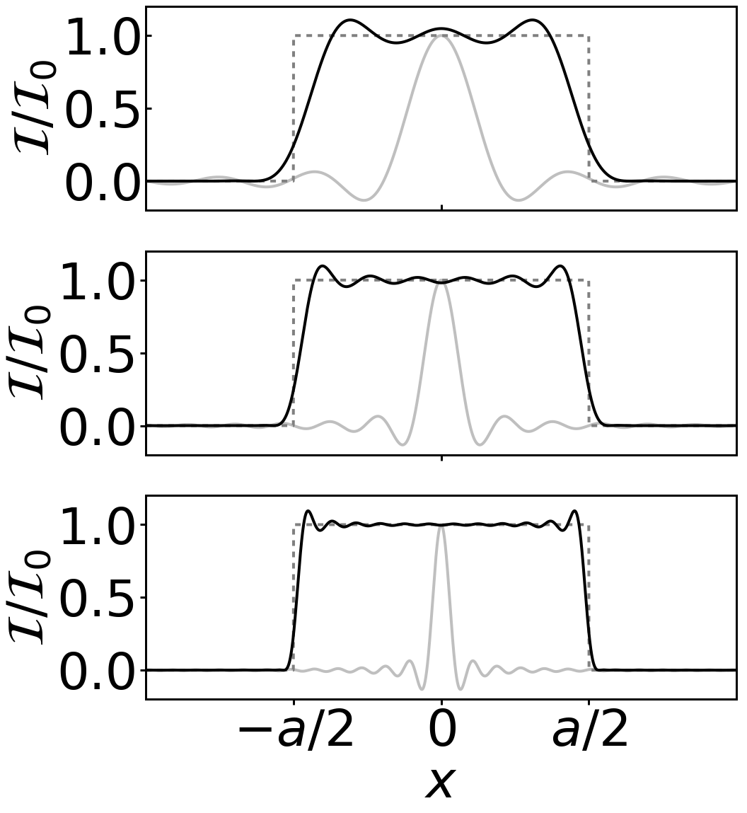
Figure 1: Coherent image of a ‘line’. The edges are distorted by the finite size of the imaging optics, i.e. diffraction removes high spatial from the image.
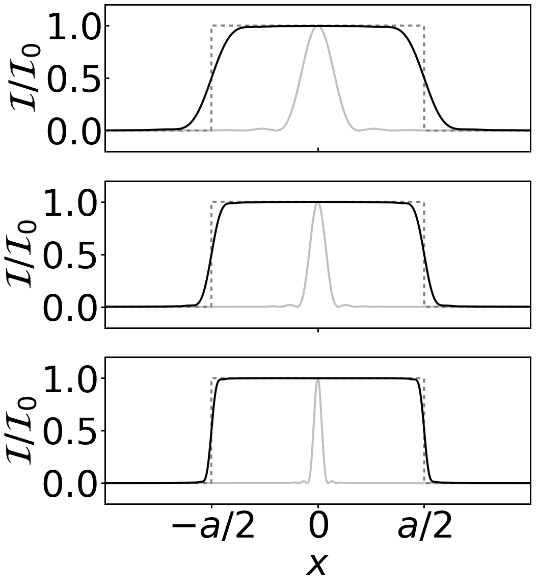
Figure 2: Incoherent image of a ‘line’. The transverse coherence length is smaller than the fringes period of Figure and not fringes are observed.
The interesting question is, why is the measured intensity at the edges of the line 1/4 and 1/2 of the maximum, respectively? Roughly, ignoring the fringes, we can think of coherent imaging as a smearing out of the amplitude (which gives an amplitude of 1/2 the maximum at the edge) and then we square to find the intensity (which gives 1/4), whereas incoherent imaging is simply a smearing out of the intensity. However, there is a problem with how this works in practice. In Chapter 8 we said that we can build up a white-light picture by summing the intensities associated with each colour (i.e. wavelength). Each wavelength will give a trace like Figure 1 but with a slightly different slope at the edge and a different fringe period. But still we expect that each component will pass through 1/4 of the maximum intensity at the edge. So how can it be, as Figure 2 suggests, that the intensity 1/2 of the maximum at the edge? The answer lies with the time average. Whereas for coherent light the field has the form of E0 cos omega t and the time average of E2 contains a 1/2. For incoherent light there is no cosine and no 1/2. We can see how the averaging works in practice by trying the simulate incoherent light as a average of many runs of coherent light imprinted with a random phase. This code simulates both coherent and incoherent imaging and was used the produce the figures below. First, in Figure 3, we show a simulation using coherent, i.e. monochromatic, light. The Figure shows the intensity in the xz plane for a one-to-one imaging system with a single lens with focal length f. The second cell in the code simulates a 4f system with two lenses. In each case we assume that the field is uniform in the y direction and that we are using cylindrical lenses such that it remains uniform in y. The input is a vertical line with horizontal width (in the x direction) a. The code uses the angular spectrum method to propagate the field as discussed in Chapter 6, and imprints a quadratic phase, see eqn (2.47) on p. 27 in Optics f2f, to simulate the lens. The lens has a finite size set by the parameter lens_radius.
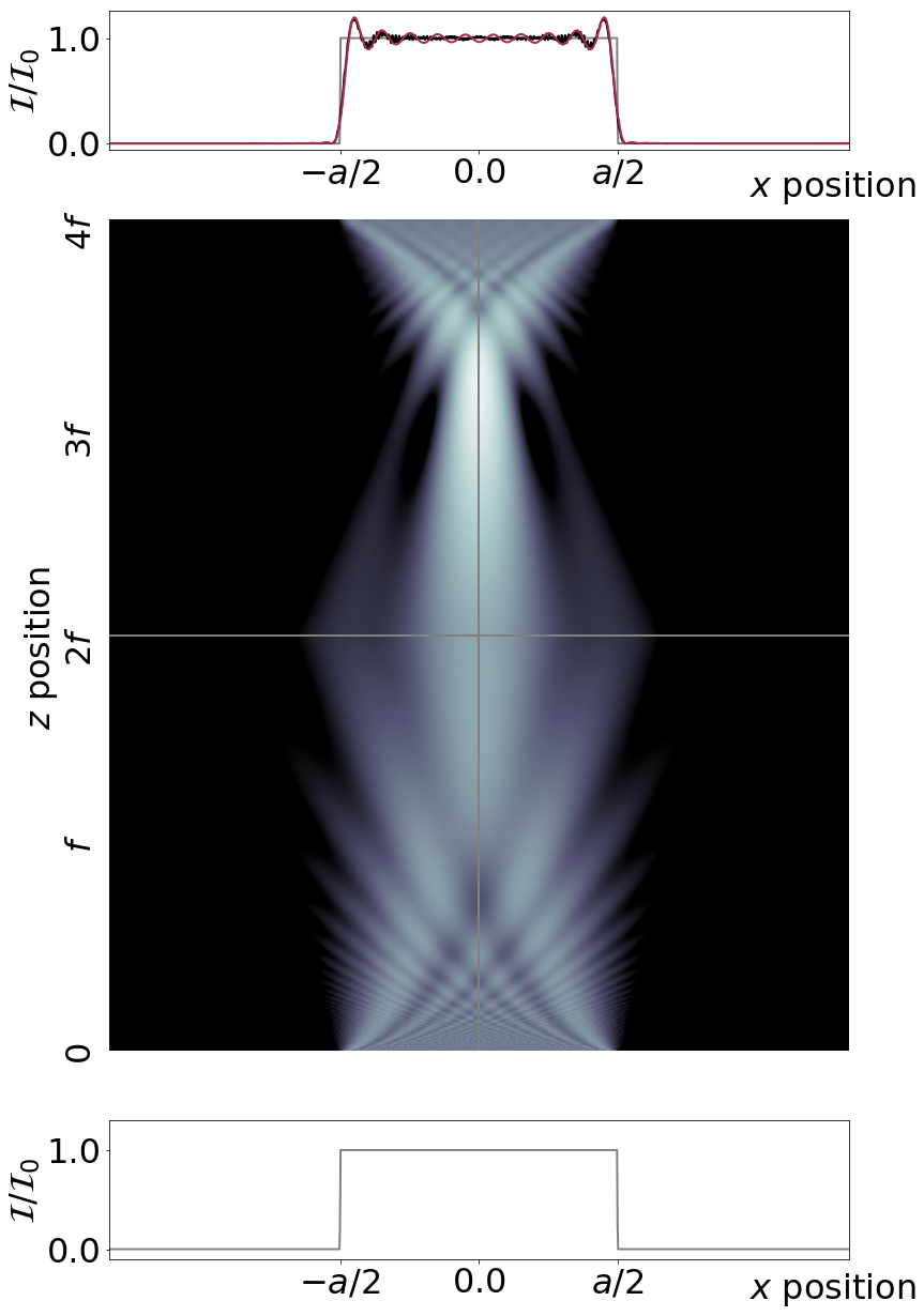
Figure 3: Coherent imaging of a vertical line of width a in the horizontal x direction. The input field is shown below, the evolution of the intensity distribution middle, and the output above. The finite size of the lenses leads to fringes in the output image. The red line shows the result of a convolution with the ampltiude point spread function. The agreement is not perfect as the full propagation is not included in the analytical solution.
To simulate incoherent imaging we multiply the input by a random phase and repeat the simulations many times to calculate an average intensity pattern. The results are shown in Figure 4. A more accurate simulation would also average over wavelength as well but as the phase average produces the effect we want to see we leave that as an exercise for the reader.
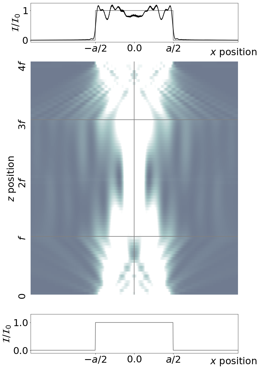
Figure 4: Incoherent imaging of a line. The same as for Figure 3 except that now the input field is multiplied by a random phase and we average over many simulations.
The subtle point of the simulation is how the temporal and spatial averaging works in the incoherent case. In the simulation we calculate E and then plot E2. In our nomralised units, both are unity. However, when we do an average for the incoherent field we get an average value of E2 equal to 0.5 (this is because neighbouring points could be either in-phase or out-of-phase so the average field is one half of the peak). So to get the correct normalised intensity for the incoherent case we need to multiply by 2 which gives of the reuslt shown in Figure 4. It is this spatial/temporal averaging factor that gives the difference between the 1/4 and 1/2 at the edge that we found confusing when comparing Figures 1 and 2.